The Show-Me Institute has added 2021–22 academic data to the MOSchoolRankings.org website. Now, users can see three years of academic data and grades for every public school, district and public charter school in the state. But let’s take a minute to address a couple of issues and likely questions. The math is a bit complicated, but for those who are interested, here are the details on how we calculate expected scores for schools.
What has changed? For the most part, the Department of Elementary and Secondary Education (DESE) data have stayed consistent from year to year. The only difference is in the growth measurement. In the past, DESE changed the growth data to be centered on the number 50, and school (or district) performance was measured as national curve equivalents (NCES) above or below 50, plus an indication as to whether a school’s (or district’s) score was statistically significantly different than the state average of 50. In 2021–22, DESE changed the measurement so that it is centered on 0 and a school’s (or district’s) score is the number of standard deviations above or below 0, plus an indication as to whether the score is statistically significantly different than 0. To the user, however, the most important components are the sign (positive or negative) and the significance indicator (yes or no). These indicate whether the students in a school or district achieved more than average or less than average academic growth in one academic year.
The measures of expected rates in proficiency in English/language arts (ELA) and math are adjusted each year. This is done by taking rates of proficiency in all schools (or districts) for that subject and the percentage of low-income students in each school or district and calculating the relationship between the two using simple linear regression. The resulting intercept (where the resulting line crosses 0) is the rate of proficiency expected in a school with 0% low-income enrollment. The slope of the line indicates how much that expected rate of proficiency declines with each one percent increase in low-income enrollment. These two numbers (the intercept and the slope) were then used to predict rates of proficiency for each school (or district) based on its percentage of low-income students. The expected score is compared to the actual score to see if a school (or district) did better than expected or worse than expected. The slope and intercept are recalculated each year based on that year’s scores.
What hasn’t changed? When this project was launched, using 2018–19 data, we calculated grade intervals for 10 indicators and committed to using the same grade intervals every year. This would allow us to see if schools (or districts) are getting progressively better over time. So, for example, for a school to get an “A” in ELA proficiency, it had to have between 72 percent and 90 percent of its students score proficient or higher. To get an “F,” it had to have 0–18 percent proficient or higher. Even though there has been a global pandemic in the meantime, we have stuck with this commitment. And now we can see how the distribution of grades has changed over time.
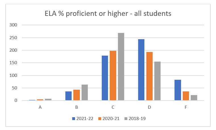
Looking at the rates of proficiency for ELA at the school level (Figure 1), we can see that in 2018–19 grades were distributed in a fairly normal way, with slightly more D’s than B’s. In 2021–22, the number of B’s and C’s declined, while the number of D’s and F’s increased. Unfortunately, that trend continued in 2021–22, with the plurality of schools receiving D’s.
Figure 1

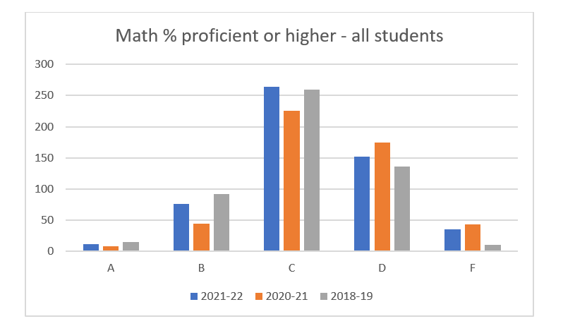
The same is not true for math, however (Figure 2). It appears that schools have recovered somewhat since the pandemic and the grade distribution looks more like it did three years ago.
Figure 2

There is much that can still be learned from the wealth of data that now exists on MOSchoolRankings. org. We welcome any user feedback or questions.


.jpg)
